

Hawaii Data Plotter

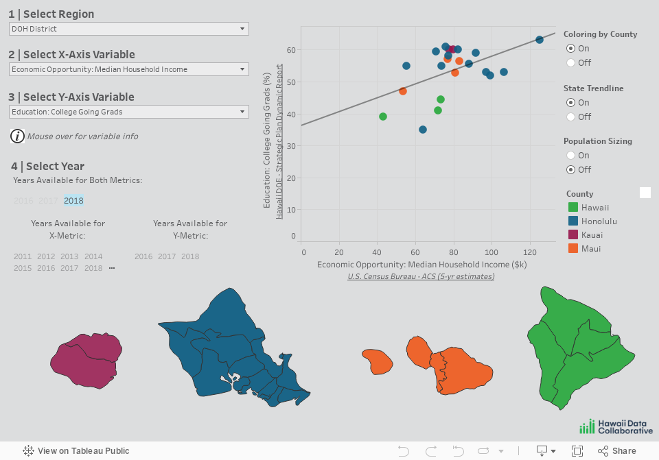
To create a plot, start by (1) choosing the tab for the desired geographic Region type at the top of the Dashboard (currently Department of Health [DOH] Communities, State House Districts, or State Senate Districts). Next, using the menus on the left side of the Dashboard, (2) select a well-being indicator for the X-axis Variable and (3) a well-being indicator for the Y-axis Variable. Finally, (4) select the Year for the X- and Y-axis variables from the options listed. The plot generated demonstrates the correlation, or relationship, between the two selected indicators for the counties and region-type communities across the state.
You can modify the features of the scatterplot using the options on the right. Coloring by County color-codes the points by their corresponding counties (pink for Kauai County, blue for Honolulu County, peach for Maui County, and green for Hawaii County). The State Trendline option creates a best fit line, i.e., a straight line that best represents the various points on the scatterplot. Population Sizing scales the size of the points on the scatterplot to reflect the relative population size of the communities they represent.
Notes: 1) We are showing source data whenever possible. However, for many sources it was necessary to use transformation procedures to standardize the indicator values along the region scheme options provided in the tool (i.e. DOH Communities, House Districts, and Senate Districts). We strongly encourage you to review our Technical Documentation to understand this approach, and to consult our Data Dictionary and the primary data sources before drawing any conclusions based on the data provided here. 2) Caution is warranted in drawing conclusions based on relationships observed in these plots. While a trendline may suggest a correlation, there are limitations to consider. Most importantly, correlation is not causation - a scatterplot does not identify causal influences between indicators. Additionally, the number of data points (i.e. communities) is small, meaning that just one or two communities can move the trendline significantly.